i chosen to do the life brief- graze
this is sort of direction i want to take on in my career with refining and resigning branding and its packaging and products to make the product work more affectively.
the creative challenge
Part a:
the graze box is the embodiment of the graze brand; it’s charming,
natural, honest, and premium, but we think it can work even harder and
bring more excitement to the food inside and to the brand as a whole.
so part a of your challenge is to refresh our graze box. all the
surfaces can be changed but the structure (size, shape and the way
it’s put together) can’t.
Part b:
We like our logo, it says friendly and has charm, but we’d love it to
be more distinctive and unique.
so, part b is to redesign our logo. Make graze stand out from the
crowd and better communicate what we are all about.
Part c:
Part c is a bit different... We want to see how these new elements
would work in a direct mail marketing campaign. We see it as a really
interesting medium and we’re looking for a creative solution that will
stand out from ‘junk mail’ and make people leap onto the internet to
sign up.
target audience
the average grazer is female, 25-45 and works in an office, but we
have grazers both male and female and of all ages, so be careful not
to exclude anyone. also remember that boxes get sent to people’s homes
as well as places of work.
creative considerations
Part a:
grazers appreciate the subtleness of the graze box, especially in
the work environment where personal mail may be frowned upon. so a
musical, neon, sequined box might not be the best solution.
the textured brown board has been a key part of the graze brand
from the start. We love the natural rough texture and the effect
of printing on the surface. however, if you think you have a better
solution and brilliant reasons to back it up, go for it.
We care for the environment just as much as we care for our grazers,
so please bear this in mind.
every graze box goes on a journey through the post so when it arrives
it shouldn’t look dirty or unappealing. We want people to jump for joy
and shout ‘huzzah!’ (and other such exclamations) when their box turns
up in their post.
use the box as a way of highlighting the tastiness and healthiness of
the food contained; the box and food should work together in delicious
harmony.
remember to allow space for the address and postage paid stamp.
a paper serviette is included in every box. consider this another
canvas to work on.
Part b:
the word graze often causes confusion – people spell it greys and
grays. could the logo help with this in any way?
our tagline ‘nature delivered’ plays a key role in explaining what we
do, so we’d prefer it if this was included in some way.
graze is a modern digital business: our boxes are ordered from our
website but all our products are sourced from nature. how can you
portray the two elements ‘online’ and ‘nature’ within the logo?
the logo should be versatile; it appears on almost everything we
produce.
don’t forget the .com (dot com).

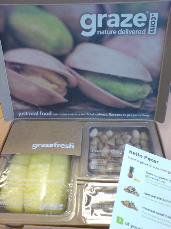
the box with flyer, personalized with the contents of your box and greeting with "hello peter" making it personal, friendly, and enjoyable
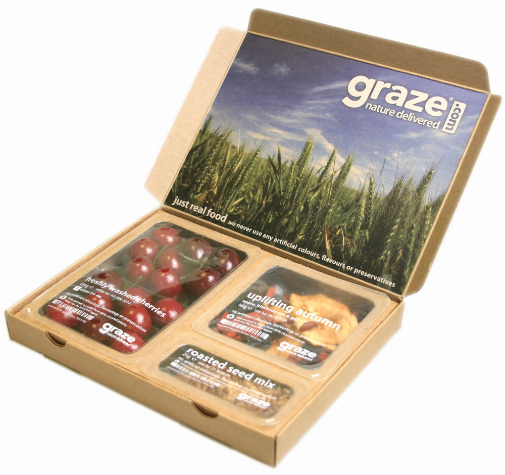
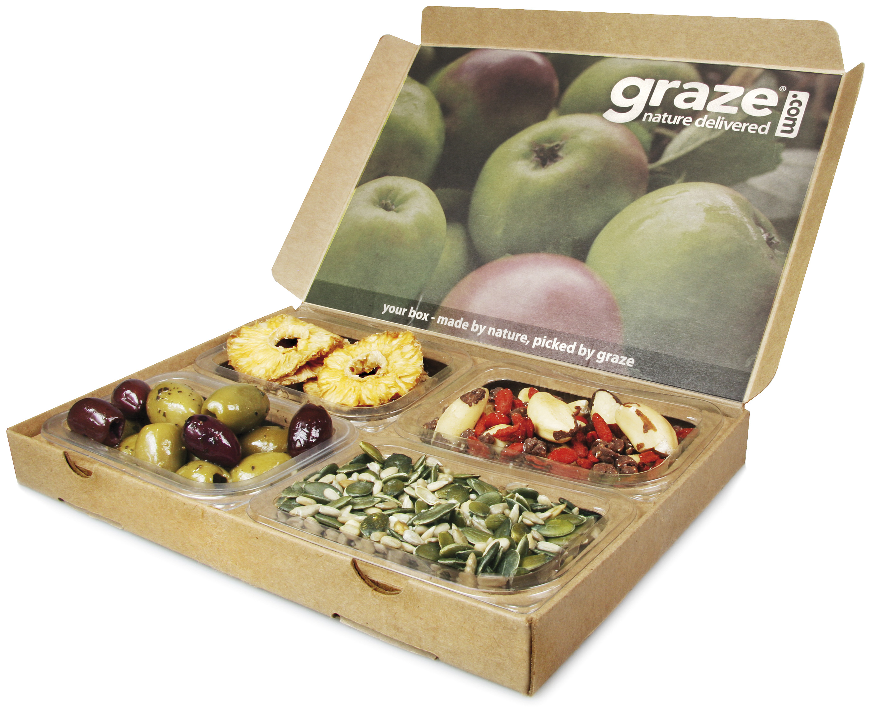
the personalised page comes inside placed above the fraze boxes and for the 3 a day boxes this is done with it used on the inside of the lid on the left side
graze comes with different photographic visuals on the inside lid of the packaging, the 3 a day box being slightly diffrent from the other boxes with more info and imagery used, i think the visual works better as they are in the images above the 3 a day box images.